Your e-commerce or corporate website will be handcrafted by our direct-response marketers and digital growth experts at website design company in Singapore, not ‘website design agencies’ whose goal is to make things look pretty.
Tag: Web Design Company Singapore
10 Best Practices To Designing a Killer Landing Page that Drives Signup
A landing page is a digital marketing tool that tries to attract as many users as possible who could be interested in what you have to offer.

Today, it’s almost impossible to grow a business in such a competitive environment without investing in your online reputation. From building an interactive website to being present on popular social media networks, businesses can’t afford to neglect the power of the online world. One of the most efficient ways to engage your target audience and drive signup is with landing pages. If your goal is to increase your sales, promote your new product or attract an entirely new audience, a landing page is a tool you need.
A landing page should be carefully created so it provides your customers and prospects with all the essential information to take the following action, whether it’s registering on the website, making an order or purchase, subscribing to your newsletter, etc. Besides helping you convert your target audience, landing pages are a great tool that increases your SEO traffic.
It’s vital that you distinguish your business website from your landing page as their goals are not the same. A landing page is a digital marketing tool that tries to attract as many users as possible who could be interested in what you have to offer. That way, these users are at the beginning of your sales funnel and it’s up to you to create additional engaging strategies that will guide them through that funnel.
So, how can you start converting your incoming traffic and encourage them to sign up? In this article, we bring you 10 best practices on how to design a killer landing page that will sweep your customers and prospects off their feet.
TABLE OF CONTENTS
- Creating clear and simple content for your landing page
- Playing with colors motivates users to stay longer on your landing page
- Don’t forget to create a responsive landing page
- Bold background usage will help you attract more visitors
- Solve the problem within the headline
- Provide your visitors with options on your landing page
- Your landing page needs to be well structured
- Connect your landing page with social media
- Incorporate a video on your landing page
- Use a FAQ section to save visitors’ and your time
1. Creating Clear and Simple Content for Your Landing Page
If a visitor needs more than three seconds to understand what your business is about, you’re doing something wrong. The words, images, fonts and the entire landing page design should be utilized in a way to convey your key message to the visitor. If you’re wondering how to design a landing page, start with these basic rules:
- Avoid creative, buzz words that mean nothing to your visitors.
- If you can say it in one sentence, don’t stretch it.
- Include your main keyword in the heading.
The Importance of the Titles on Your Landing Pages
Make sure your title is clear and readable. Of course, you shouldn’t avoid playing with words but each word needs to be carefully used within the landing page, from the title to the call-to-action button. Headings which let the visitor know immediately what the landing page is about will ensure the visitor stays longer which helps to convert him.
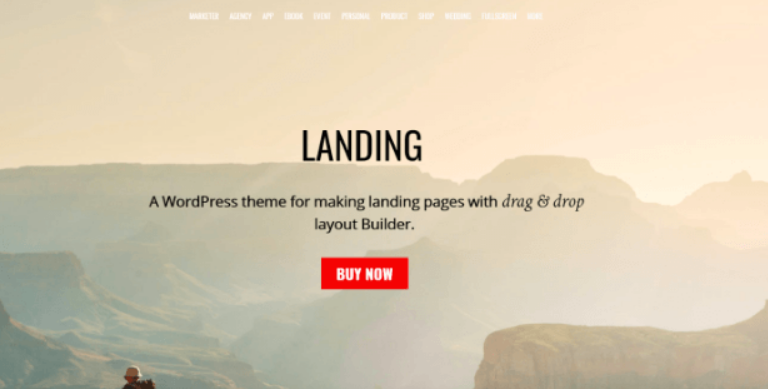
Landing WordPress Theme: Making it as Simple as Possible
This Landing WordPress theme allows its users to navigate in a simple way and enjoy the content on their page. Not to mention that the red colour of the call-to-action button truly invites you to react immediately!
2. Playing with Colors Motivates Users to Stay Longer on Your Landing Page
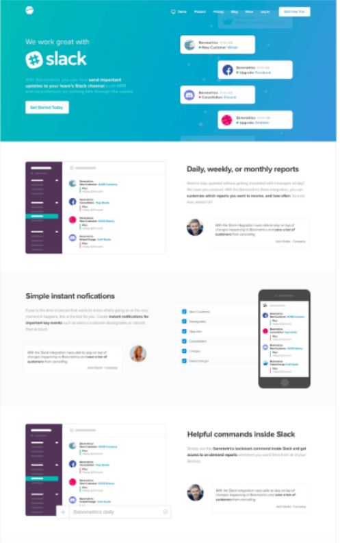
No matter what the nature of your business is, you can always decide to add a splash of colors to make it a bit more interesting and engaging. If you’re uncertain on how to design a landing page, you can take a look at how other successful companies do it. One of these companies is Slack. They are always killing it when it comes to design, but this landing page is so captivating thanks to a clever color combination.
Slack: The Game of Colors is Company’s Signature Move
They’ve written a fantastic, informative text for the entire landing page but the overall impression is much stronger due to the usage of turquoise and purple color. Also, they’ve managed to carefully implement their features and highlight them even more with such a great design.
3. Don’t Forget to Create a Responsive Landing Page
Just a few years ago, it was enough to ensure your landing page has a terrific design and functionality to have a successful page. As the habits of the users and the market itself are changing, your landing pages need to provide so much more if you wish to drive signups. You will need to have a fully responsive design and if you think that’s not that important, you couldn’t be more wrong.
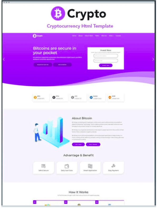
B-Crypto: 100% Responsive Landing Page
Your users are visiting your landing page from their smartphones, laptops, tablets, personal computers, etc. Are you providing them with the same level of experience, regardless of the device they’re using? Take a look at the B-Crypto landing page example as it 100% responsive. It will be correctly displayed on any device you utilize and as it’s one of the imperatives of good design, it will motivate your visitors to stick around and enjoy that experience a bit longer.
4. Bold Background Usage Will Help You Attract More Visitors
You might think ‘What does a bold background has to do with my traffic’? Well, a lot. Readability is very important for landing pages as it affects the product and business performance. Would you be impacted the same way with a sentence written on a white background and on black? Of course, not. Unfortunately, psychology is not as simple as we like to think it is. When you’re choosing colors for your landing page, you have to keep accessibility in mind all the time. Here are a few tips that might help you with that:
- Test the fonts, images and icons on different devices before making a decision.
- Different colors inspire different emotions and you should know why you are choosing a particular color.
- Don’t forget about the balance between the background and text.
5. Solve the Problem within the Headline
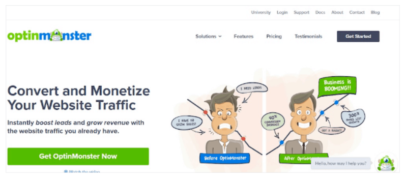
Why should somebody take a look at your product or service? What’s in it for them? If you incorporate what problem does your product or service solve, it will engage the visitor and encourage him to sign up. After all, you can’t expect a reaction from your visitors if they are unable to recognize the value you provide to them. You need to be aware that a headline can either drive a significant amount of traffic to your landing page or completely destroy the entire experience. Don’t neglect its power! Check out the simple example of OptinMonster below.
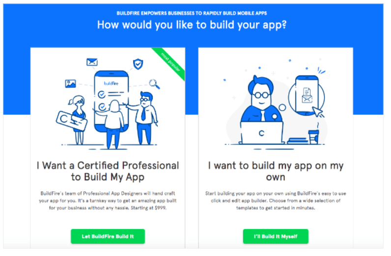
6. Provide Your Visitors with Options on Your Landing Page
If you want to get more visitors to sign up, but you’re uncertain on how to design a landing page to achieve that, start with creating different options for them. Don’t go too far and create more than three or four options if you don’t want your customers and prospects to get overwhelmed. Instead, create two or three main options for them to click on as soon as they land on your page.
BuildFire: Simplifying it for the Customers
Let them know you understand what they might be interested in and that your business is perfect for either of the provided options. Take a look at a great example by BuildFire, where they created two simple options with captivating images and engaging colors to attract more people to sign up.
7. Your Landing Page Needs To Be Well Structured
Can a visitor notice a hierarchy of the information once he enters your website? Do you know which information needs to be placed at the top and which at the bottom of your landing page? The structure of a landing page is very important. Organizing all the elements in a logical sequence will keep your visitors to scroll down to the bottom of your landing page and also take the right actions while scrolling. Your landing page should have a structure similar to this one:
- Catchy, informative headline
- Engaging photo
- Brief contact form
- Features of your product or service
One X Tech Launches Digitize™ Program
One X Tech, the world’s first digital business platform, today announced that it has launched a new initiative aimed at encouraging companies to take their first step towards developing digital capabilities. Known as the One X Tech Digitize™ Program, the new initiative helps companies build stronger digital capabilities and deploy IT solutions in their business.
Under the Digitize™ program, companies can receive up to $5,000 worth of credits to exchange for digital services, and be entitled to book exclusive training sessions with One X Tech’s digital consultants. The program is available to enterprise clients, small/medium businesses, and early-stage companies, with benefits catered specially to the needs of each group.
Web Development Company Singapore
Website development is an art that work for small to large size industries. Online websites help you get clients and customers around the globe that will be beneficial for your business. One X Tech is one the best website development companies in Singapore, always available to assist you in developing and designing website for your business. Get in touch with our experts and know more about the services we offer.

Build Tailored-Made Websites As Per Your Requirement
Most businesses with a web presence opt for customized webpages in order to differentiate themselves. Web development services serve an integral part in fulfilling the demand for customized webpages. We offer web development services and help you build a website as per your needs. For more info visit: www.onextech.com/
Enterprise Application Development
At one x tech, we deliver effective solutions that can transform their business. We assist enterprise clients in their digital transformation by applying established and emerging technologies into their core business models. We have an experienced team that provides services like, web designing, development, and also, digital branding and transformation.
